This is the second installment in the TA literacy series that will be available exclusively to paid subscribers.
What Are Candles?
When it comes to candles, there are a few key things you need to know.
What types of candles there are, identifying and understanding what the different parts of the candles represent, and what data can be extrapolated from the candles themselves.
Types of candles
In this first image you can see there are two different types of candles.
ACCUMULATION CANDLES (White):
Indicates that when the candle closed, the price was higher than the previous candle’s closing point.
DISTRIBUTION CANDLES (Blue):
Indicates that when the candle closed, the price was lower than the previous candles closing point.
Traditionally, the color scheme will be green for accumulation, and red for distribution, but this color scheme has a significant psychological impact compared to my preferred white and blue scheme. There are also sixteen different styles of candles that Trading View offers, but for all TA conducted using the techniques included in this collection, you will be required to use traditional candles.
The Different Components of a Candle
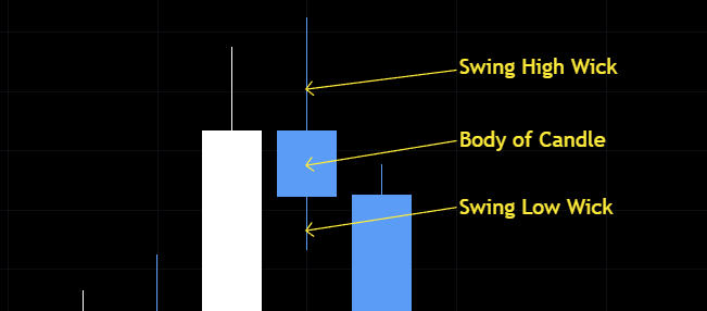
This image identifies three parts of a candle. Both accumulation and distribution candles have the exact same core components.
BODY— Indicates the range of price action that occurred from when the candle opens, to when the candle closes.
SWING HIGH WICK — Indicates that price rose above either the open or close, but then fell back down before the candle closed.
SWING LOW WICK — Indicates that price fell below the open or close, but then rose again before the candle closed.
How to Identify Where a Candle Opens and Closes
This chart points to the side of the candle’s body that indicates the OPENING or CLOSING of both accumulation and distribution candles.
The BOTTOM-SIDE body of an accumulation candle indicates where the price was when the candle OPENED.
The TOP-SIDE body of an accumulation candle indicates where the price was when the candle CLOSED.
The BOTTOM-SIDE body of a distribution candle indicates where the price was when the candle CLOSED.
The TOP-SIDE body of a distribution candle indicates where the price was when the candle OPENED.
NOTE:
The opening of a candle should be the same exact point at which the previous candle closed. This is a rule that will almost always be reflected in the charts. The only exceptions would be if an exchange goes down for maintenance, or if you’re trading stocks and the trading day ends, there would be no data after it closes. Cryptos are traded 24/7, thus there would be no breaks or “Gaps” as the traditional market traders call it.
For now, this is all you need to know about candles. Understanding how to read candles is important when applying other concepts, such as level and trend identification, and more advanced topics that will be covered in later lessons.
Trend identification
This section will cover how to identify trends by analyzing candles, as well as how to draw relevant up-trends and down-trends.
First, you must understand what peaks and valleys are, and how they’re connected to drawing trends properly. In addition to this, you will look at the specific method by which we draw anchor points and reach points on accumulation and distribution candles respectively.
Just keep in mind these are a mix of beginner level and intermediate level concepts, so if you are struggling, don’t be discouraged.
Identifying Trends via Candles
When it comes to identifying the current trend, you can start by looking at candles.
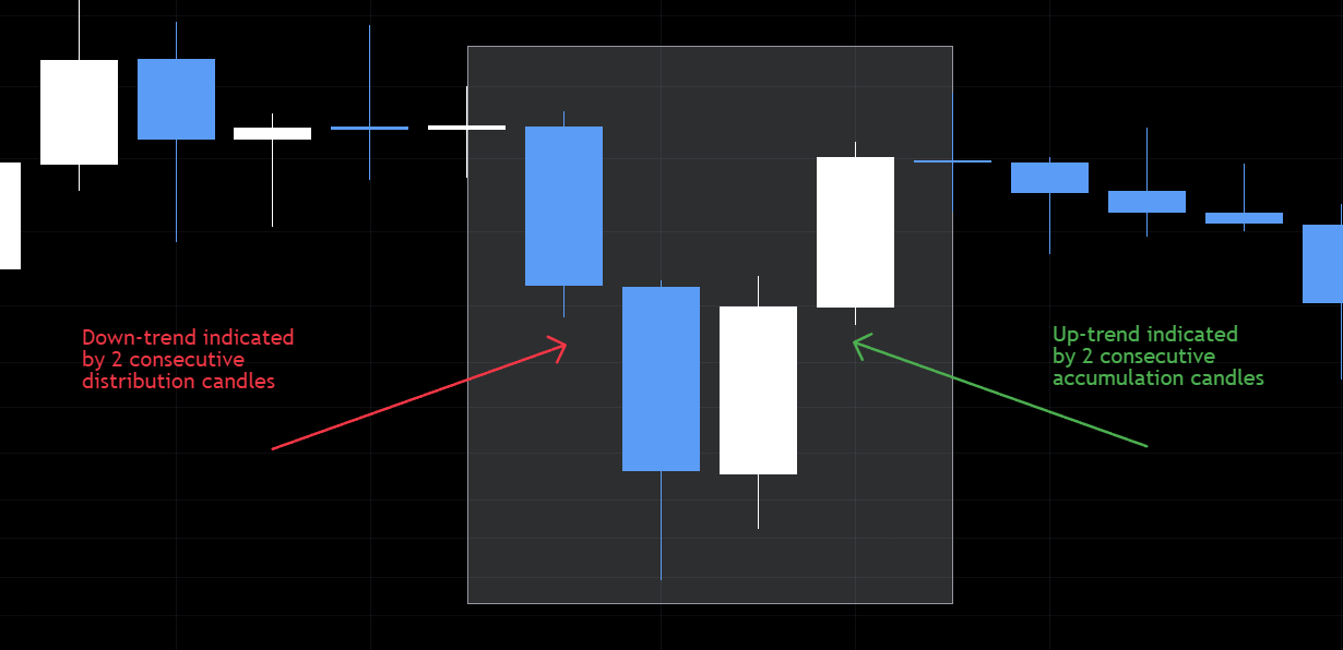
The grouping of candles highlighted is an example of a down-trend followed by an up-trend, and would also be considered a cycle, or move.
What you would do after identifying this cycle is move down into a lower timeframe to gain more detailed insight into how this move played out over the four days represented by these daily candles.
Peaks and Valleys
In this section you’ll find a brief, yet detailed synopsis of what peaks and valleys are. What constitutes a peak or valley will vary depending on whether it’s an up-trend, or a down-trend.
The PEAK of a down trend will be the lowest point of the last distribution candle in the trend.
The VALLEY of the down trend will be the highest point of the first distribution candle in the trend.

Inversely, the PEAK of an up-trend will be the highest point in the last accumulation candle of that trend.
The VALLEY of an up-trend will be the lowest point in the first accumulation candle of that trend.

PEAKS and VALLEYS are one of the most important concepts to understand, as the more advanced concepts build upon them, developing our understanding of their relevance and functions.
They play into concepts such as cycles, price structures of moves, breakout zones, points of polarity, Origin levels, Break levels, ranges, and in general they give us indications as to what price actions will do next!
Trendlines
Now let’s get into some actual “how-to” on drawing proper trend— lines. We have two different types of trends that we’ll be covering in this lesson.
Up-Trends
Down-Trends
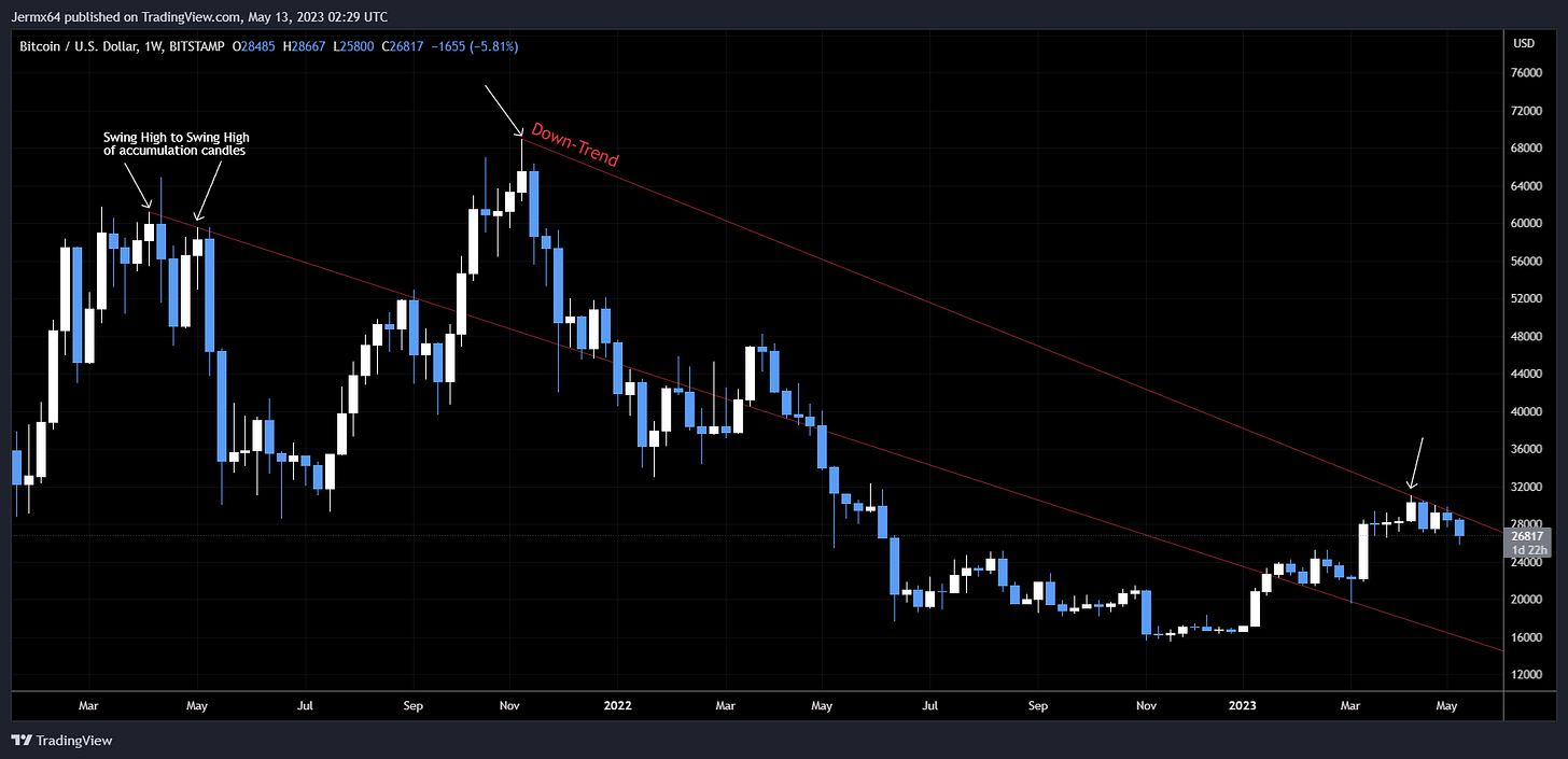
DOWN-TRENDS are drawn from the swing high of an accumulation candle that is the peak of an uptrend, to the following swing high of an accumulation candle in the next uptrend.
If you notice in this image, you can see how the “Anchor Point” is the Swing High Wick of the accumulation candle that was the highest point, or peak of that larger move up. The “Reach Point” is then drawn to the next Swing High Wick of an accumulation candle that is also the peak of a larger move up.
If you follow this hard-set rule of drawing them from accumulation candle to accumulation candle, you will have more accurate trend lines than most traders. In a later lesson you’ll will learn why it matters, but for now, just know that it will give you earlier entries, and more opportunities for trades within a specific range.
NOTE:
You may have noticed that the lower downtrend is drawn through the swing high wick of a distribution candle. It may seem incorrect at face value, but regarding the time frame that we’re currently working in, that swing high wick would NOT be considered a valid Anchor Point or Reach Point.
If you were to break down into the lower timeframes, you may be able to find one where that swing high is part of an accumulation candle, but that trend would only apply to that timeframe, and considering it would be a lower timeframe trend, it would have less relative strength compared to these weekly trends.
UPTRENDS are drawn using an inverse set of rules to down-trends. The reach point for the uptrend will be drawn on the swing low wick of the lowest distribution candle in a larger move down, while the reach point would be drawn at the next swing low wick of the lowest distribution candle in a larger move down that follows.
If you flipped your chart using the “invert scale” option, you would see how it’s essentially the same method just applied inversely.
I intended on covering Levels in the lesson as well, but due to email size constraints, I will make that a separate post. There is easily enough info to go over to have one dedicated to it.
But you can look forward to lesson 3, which discusses the EFFECTS OF TIME. This will be followed by the lesson on LEVELS.
My goal with this collection is to breakdown the things I’ve learned over the past 4.5 years in a consumable manner using visuals paired with detailed explanations on how to identify, understand, and apply the science behind trading.
These techniques are not my own, and this iteration of them is a condensed image and text based version of what is offered by C0TT0NC4NDYTA on YouTube.


