This is the first installment in the TA literacy series that will be available exclusively to paid subscribers.
Update (5/19)
With the release of Lesson 3, Lesson 1 has now been unlocked and will no longer be behind a paywall. Thanks for your continued support! Enjoy, and consider a paid subscription if you would like to continue with this course, or if you simply enjoy the work we do!
Thanks!
TradingView Guide
TradingView is hands down one of the best, if not THE best platform for all your charting and trading needs. It is the primary program you will use to chart and trade any stocks, indexes, and cryptos.
This lesson will cover the key features you will likely benefit from, the way to adjust the chart settings, set templates, and get ready to start trading!
To start, you must set up a FREE account. There is ZERO reason you should have to pay for TradingView to trade using these techniques. Everything that comes along with the different tiers of premium membership is luxury. They can be helpful at times, but profits are what matters, and spending upwards of $70 a month for your trading/charting platform this early on in your trading career is not starting off on the right foot. Do not put yourself in the negative before you get your footing.
Adding Symbols to Your Watchlist
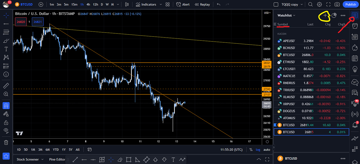
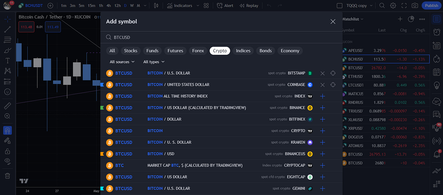
Now that you’ve created your account, we should look at adding some tickers to your watchlist. This is a very simple process. All you must do is click on the topmost button which is indicated with the red arrow, then click the “+” to pull up the search bar. Just type in the handle for whichever stock or crypto you wish to chart. For now, starting with BTCUSD from a US based exchange, such as Coinbase will suffice.
(Pick the exchange you will be trading on so the data’s accurate)


Chart Settings
Next, go into your chart settings to adjust a couple things.
Firstly, its IMPERATIVE that you change your candles color scheme away from the traditional RED and GREEN as it is proven to have significant psychological impacts on your executive functions. You need to have as little psychological factors impeding your ability to make decisions while trading. You are dealing with real money, and there is already a strong emotional response you will have the moment you enter a trade. It’s not mandatory, but HIGHLY recommended.
My preferred scheme is the BLUE and OFF-WHITE combination, where BLUE is the distribution candle, and OFF-WHITE is the accumulation candle.
To adjust the chart settings, simply right click anywhere on the chart, then click on the settings tab at the bottom of the pop-up menu, and simply copy the same settings in this image below.
Really all you’ll need to go into these four settings tabs:
Symbol
Status Line
Scales
Appearance
I haphazardly cropped screenshots of my settings for you to mimic. It’s just much simpler than trying to type instructions out for every single setting.
Tools and Templates
Now that you have the preferred settings in place, here is the criteria for creating your level and trend templates that will allow you to seamlessly apply them to your chart. This will probably take a little time, but the time saved in doing so far surpasses how much of a drag setting this stuff up can be. Once it’s done, you do not ever have to do it again. Perks!
So, you will want to toggle on the “favorites bar” by clicking on the “star button” in the bottom left corner. You may need to scroll down to it if it is not visible by default.
Once you do this you can now add different tools from the tool bar on the left hand side to it, giving you quicker access to the tools you use regularly, such as horizontal rays, trend lines, and some others you may find useful.
Next, you should toggle ON the “magnet tool” which anchors your cursor to the closet point on the candle nearest to it, which is important as it will give you a precise application of your levels and trends.
I suggest “strong magnet mode” over the weak option, but that’s more of a personal preference than a requirement.
Now that you’ve completed these steps, you need to click on the second tool tab from the top on the left-hand side and select “Horizontal Ray”. Once you do, you should be able to drag your cursor over the chart and hover it over a candle, then left click to apply.
Next, you should right click on the horizontal ray so that it pulls up the “tool settings bar” where you will be able to adjust the settings for this specific ray. You will also find the “Template” tab on the left-hand side of this tool bar where you can save the settings you’ve input for this level so that you can apply this template to any levels going forward.
This is how you will create your full list of templates for levels and trends. The following criteria will need to be entered for both tools so that you have all the templates you’ll need from here on out. It’s tedious, but necessary.
Here is the list:
PS you will have to click “Save Template” and name them accordingly as you apply the settings.
Levels:
Monthly (White) : Visibility One Month—One Minute
Weekly (Purple) : Visibility One Week—One Minute
Daily (Red) : Visibility One Day—One Minute
4 Hour (Yellow) : Visibility 4 hours—One Minute
1 Hour (Orange) : Visibility 1 Hour—One Minute
15 Minute (Light Blue) : Visibility 15 Minutes—One Minute
5 Minute (Dark Blue) : Visibility 5 Minutes—One Minute
1 Minute (Green or Beige) : Visibility 1 Minute—One Minute
Now go back into that same tools tab and select “Trend Line”. This is twice as complicated as applying levels. You have an “Anchor Point” and a “Reach Point” where the anchor is your origination point for your trend line, and the reach is the second point for your trend line that will establish your trend.
Simply attach the first point on any one candle, then attach the second to a separate candle somewhere forward in time on the chart.
(For the purpose of this setup, you can set the trend at random)
Criteria for Trend Lines below. *Same as Levels*
Trends:
Monthly (White) : Visibility One Month—One Minute
Weekly (Purple) : Visibility One Week—One Minute
Daily (Red) : Visibility One Day—One Minute
4 Hour (Yellow) : Visibility 4 hours—One Minute
1 Hour (Orange) : Visibility 1 Hour—One Minute
15 Minute (Light Blue) : Visibility 15 Minutes—One Minute
5 Minute (Dark Blue) : Visibility 5 Minutes—One Minute
1 Minute (Green or Beige) : Visibility 1 Minute—One Minute
(BE SURE TO SET TREND LINES TO EXTEND RIGHT LINE IN SETTINGS)
(You will have to click “Save Template” and name them accordingly as you apply the settings)
Now you know how to draw levels and trends! WOOT! It’s really that simple.
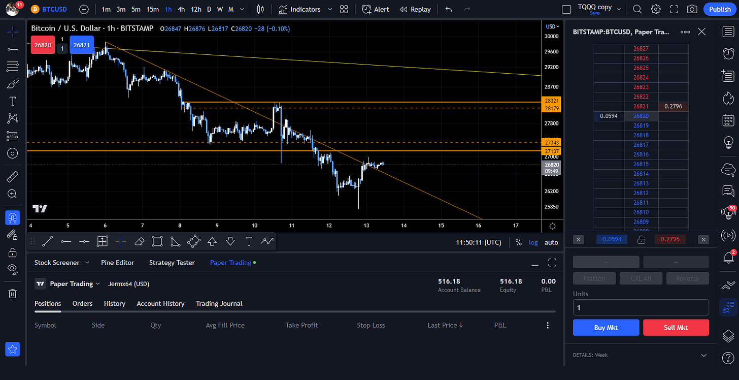
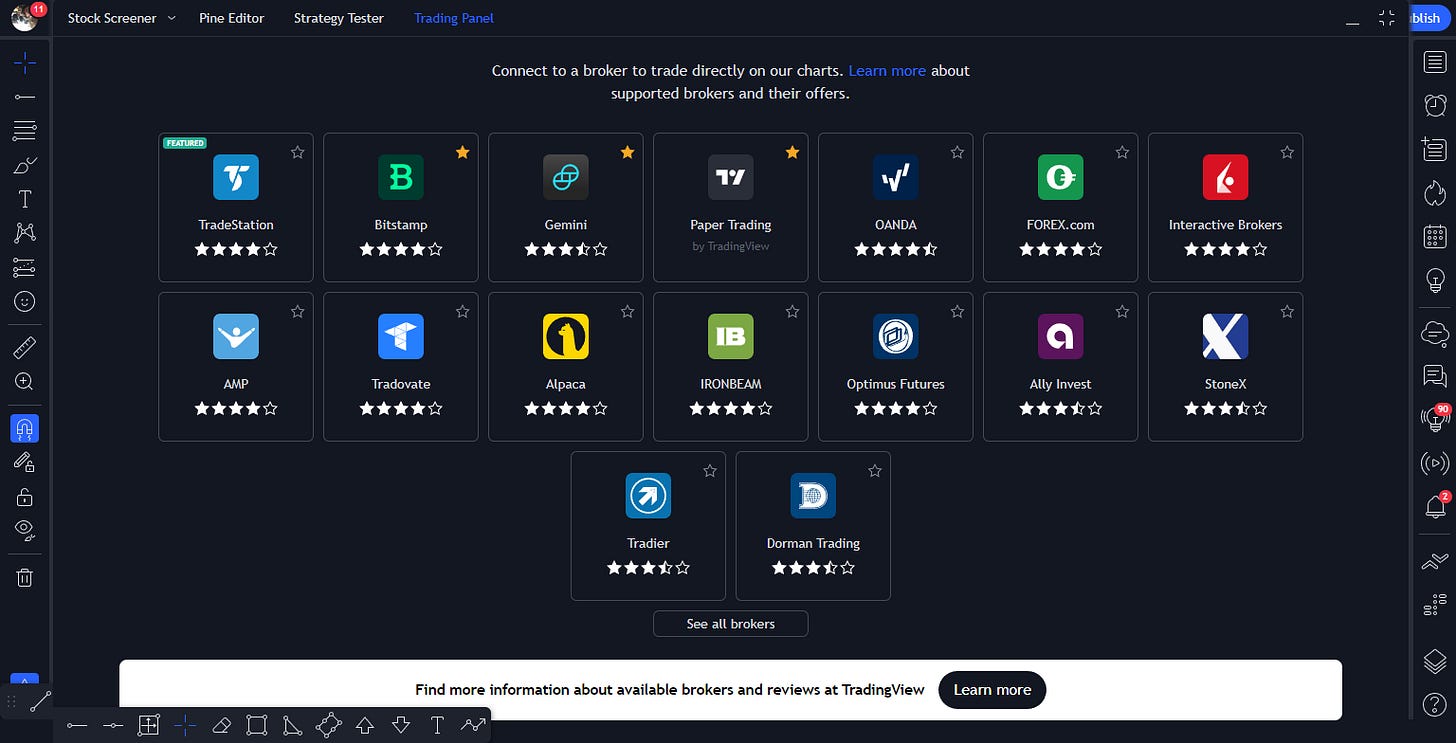
They have a really fantastic brokerage integration system that allows you to seamlessly trade via any of their onboarded brokerages right from your chart interface! There is no need to tab back and forth between windows which, for someone who only has a laptop, is an extremely useful tool. Whereas others may choose to simply have a desktop with multiple screens for ease of use.
When it comes to timing your entries and exits, it’s quite important to be able to react swiftly so you do not miss out. Large injections of capital can happen very quickly, and if you are not reacting in a timely manner, you are losing.

There are some different trading settings you can mess with in the “Chart Settings” if you’d like to check them out. That should cover all the necessities!
Please leave feedback so I can make these lessons easier to understand. This stuff is challenging, so please don’t refrain from asking for help. I will gladly assist in any way I can!
My goal with this collection is to breakdown the things I’ve learned over the past 4.5 years in a consumable manner using visuals paired with detailed explanations on how to identify, understand, and apply the science behind trading.
These techniques are not my own, and this iteration of them is a condensed image and text based version of what is offered by C0TT0NC4NDYTA on YouTube.
Till next time!


